Results and Conclusion
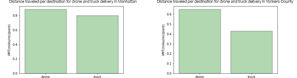
Vehicle Mile Traveled (VMT) Comparison
VMT for both delivery-by-drone and delivery-by-truck models have been calculated from the spatial analysis by summing total distance and then dividing by total number of recipients. As seen here, drones witness higher VMT although they travel in straight line paths.
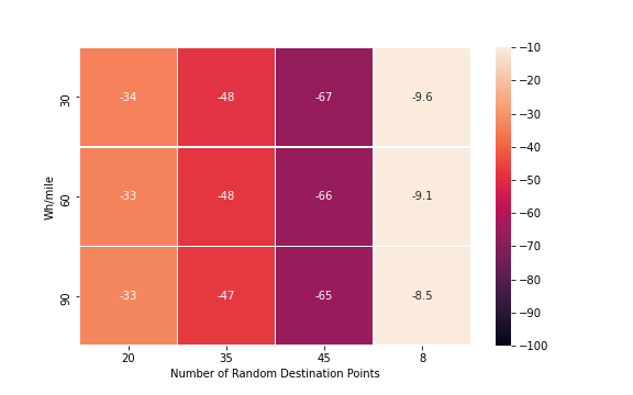
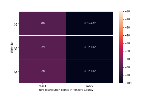
Heatmap of kgCO2 Emission Differences
CO2 emission calculations for trucks are based on distance traveled. Carbon emission for drones cannot be accounted solely based on its miles traveled as delivery-drones do not have tailpipe emissions. Hence, AER which is the average energy requirement of the drone in Wh per mile was factored in to normalize energy expended by truck and drones in order to compare. Three sub scenarios were created with AER of 30Wh/mile, 60Wh/mile and 90Wh/mile. The final Seaborn plot shows a heatmap of CO2 emission differences between drone and truck deliveries with varying drone energy requirements for urban (Manhattan) and sub-urban (Yonkers) area. Cells with negative values indicate that drone emit less CO2 than Trucks.
Manhattan
Yonkers County
Conclusion:
• Since the scope of analysis is limited to a 1 mile radius, the emissions of drones had negligible differences with varying energy requirements in all conditions.
• We could infer that a higher difference in CO2 emissions was due to larger distances (number of points in the case of urban condition) leading to trucks emitting more CO2 than drones.
• In order to study a scenario where drones emit more CO2, a larger radius may have to be considered and studied.
• We see a similar scenario in sub-urban conditions as well with truck emissions exceeding drone emissions resulting in higher differences.
• However, a valid comparison between urban and sub-urban condition cannot be established given that UPS stores are scarcely located, number of deliveries and times of delivery is uncertain.